Inspiration
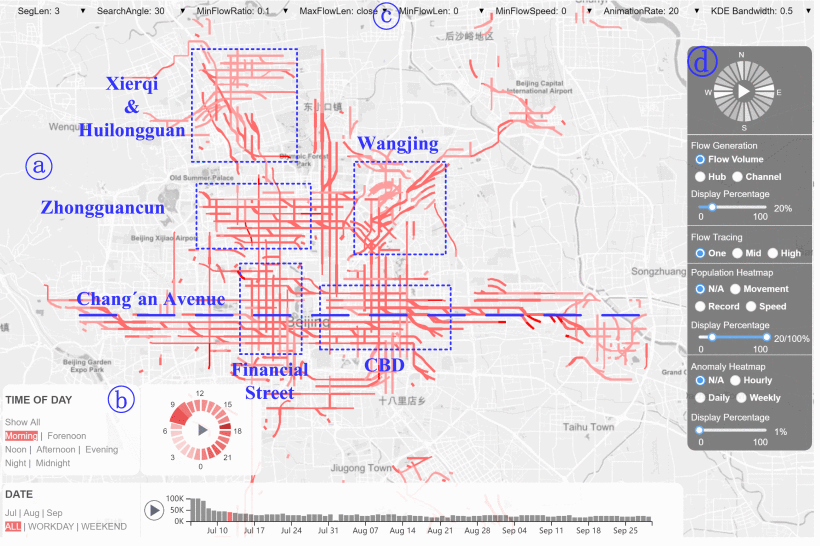
As 6030 students, we focused on relating our problem to state-of-the-art research. We were interested in new and fresh visualization problems concerning city density and how these visualizations could help solve infrastructure issues. We found an article on the IEEE Transactions on Visualization and Computer Graphics. The article is titled “UrbanMotion: Visual Analysis of Metropolitan-Scale Sparse Trajectories.”
The main summary of the research article uses smart device data in three major cities in China (Beijing, Tianjin, and Tangshan) to create a dashboard called UrbanMotion (Figure 1) that visualizes multi-directional population flows of each city. This visualization was found helpful in “visually analyzing population movement in modern cities and having the potential to help in real-world applications such as “traffic optimization, urban planning, and business site configuration. We took inspiration from this article to formulate the problems we want to solve using a dataset we found of pedestrian movement in Melbourne, Australia.

For our visualization design, we want to draw reference and reflect on the paper that we have based our project on. Because staying close to state-of-the-art research is one of our primary goals. To achieve this goal, we reviewed the main visualizations that the paper showed throughout. Our visualization here is the result of that research.
About This Visualization
By using a dataset of pedestrian sensors that count the number of pedestrians at certain streets, we are seeking to understand the trends of pedestrian movement in Melbourne, Australia.
Melbourne, Australia Pedestrian Dataset
We are using a dataset collected by the city of Melbourne, Australia that shows the number of pedestrians identified by sensors in different areas of Melbourne. Currently, there are 3.86 million rows of data for this dataset. The data starts in 2009, and is updated every month.
Our data has 13 columns. In each row, there is a unique ID, the date and time of the reading in the format: dd/mm/yyyy hh:mm:ss, the year of the sensor reading, the month, the day of the year in number format, the day of the week, the time of day in 24 hour format, the sensor ID, the sensor name, the hourly counts for that sensor, and the latitude and longitude location of the sensor.
Our Questions
There are two primary questions we would like to answer with our visualization:
- How can the knowledge of massive human movement in Melbourne contribute to optimizing infrastructures such as energy, traffic, and urban planning?
- Is pedestrian movement influenced by a deviation in weather (e.g. rain, extreme heat) or a natural disaster (e.g. earthquake, flood)?
Multiple benefits arise from answering these two questions that are interrelated to each other. By visualizing our pedestrian dataset we would like to visualize mass movement of pedestrians. This will allow us to focus city infrastructure efforts toward the most heavily populated routes of pedestrians, avoiding unnecessary costs as well as improving infrastructure that is the most important to pedestrians. By seeing how deviations in weather or a natural disaster influence pedestrian movement, we will be able to see what areas of Melbourne need infrastructure improvements to prevent mass pedestrian movement to a specific area of Melbourne (e.g., adding more shade in areas where pedestrians move away from because of extreme heat).
Visuals Explanation
In order to complete our desired visualization we utlized the Deck.gl framework, designed to simplify visual exploratory data analysis of large datasets. By using deck.gl we are able to visual a base map (using cartomap) and create a layer to visual data based on certain longitude and latitude coordinates. In our case we used a hexagon shaped layer over a map of Melbourne Australia. Each hexagon is located on a specific street in Melbourne and a color spectrum is utilized the showcase the density of pedestrians at that certain date and hour. The more red a hexagon is, the more pedestrians past through that street at that specific time interval.
Main Visualization
Go to Visual
This visualization shows the hourly pedestrian density on a certain street, day, and hour in Melbourne, Australia for the month of November, 2019.
The hexagon layer hovers over a street and its color presents the pedestrian count for that specific street.
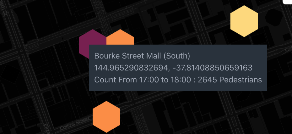
By hovering over a hexagon you will be greeted with the street name, coordinates of that
street sensor and the count of pedestrians for that time range (figure 2).

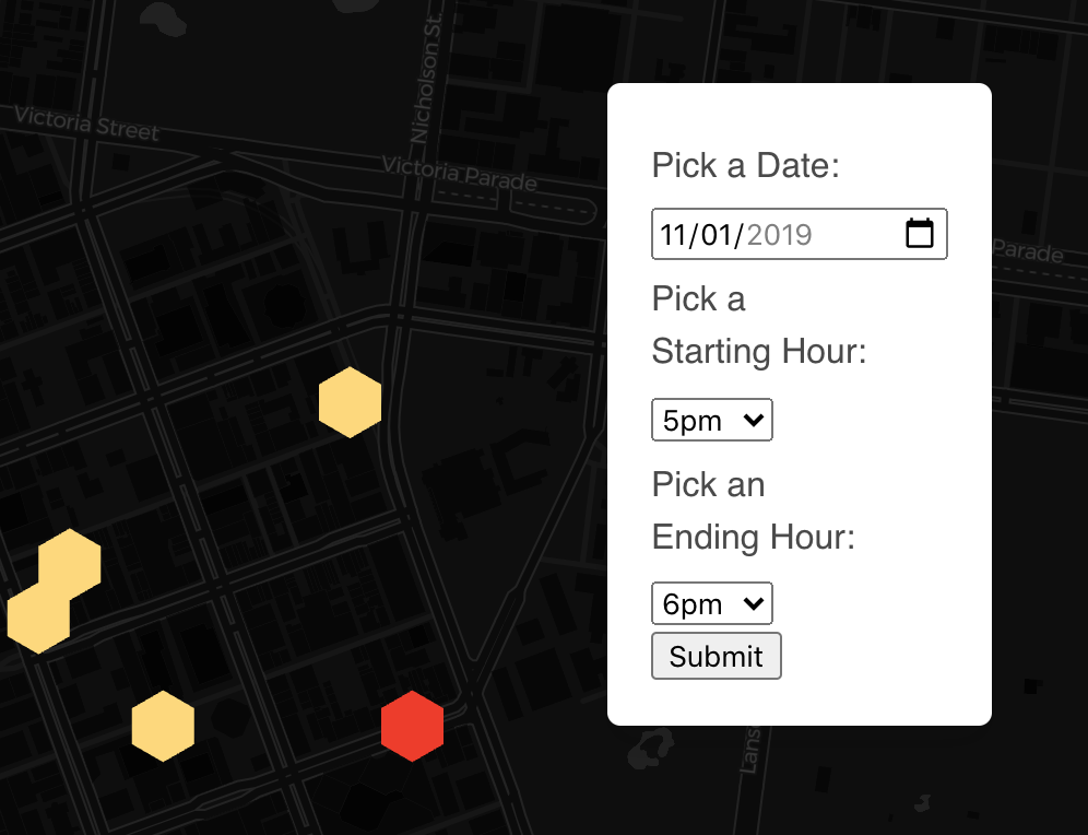
You can also filter by date and hour range using the filter box on the map. You can pick any day in the month
November, 2019. You can choose any time range by picking a starting hour and an ending hour (figure 3).

You can click on a hexagon and a tooltip will appear on the left of the screen showing the street name, coordinates
of that street sensor, the date, the pedestrian count for the time range, and a barchart that shows the pedestrian
count for each hour of the day. The x-axis presents the time with the labels 0-23 where 0 = midnight-1am, 1 = 1am-2am, 2 = 2am-3am, ..., and 23 = 11pm-midnight
If you click on another hexagon, that hexagon's tooltip will show below the tooltip you first clicked
Each hexagon you click and its corresponding tooltip will have the same color to let you know when tooltip corresponds
to which hexagon. For example you can see in the figure below that the two hexagons I clicked have a colored circle
and that color is the border of the bars in the barchart for that hexagon. Y-axes for the barcharts will be resized
according to scale in the comparison(figure 4).

Here we summarize all the features of how the visualization works.
Natural Disaster Visualization
Go to Visual
Our natural disaster visualization compares the hourly pedestrian density between an extreme weather day and a normal day. We are using
November 21st, 2016 as our extreme weather day.
On November 21st, 2016 an asthma thunderstorm kills 9 and hospitalises hundreds, high heat and humidity cause thunderstorms to form northwest of the city, due to excessive grass growth in the north and west of Melbourne these storms send pollen into Melbourne and its suburbs raising pollen counts and triggering thousands of severe asthma attacks. This thunderstorm started at around 5:30 p.m. The massive number of attacks overloaded emergency services and contributed to the fatalities. We will compare the pedestrian density of this specific day to a normal weather day, May 2nd, 2019.
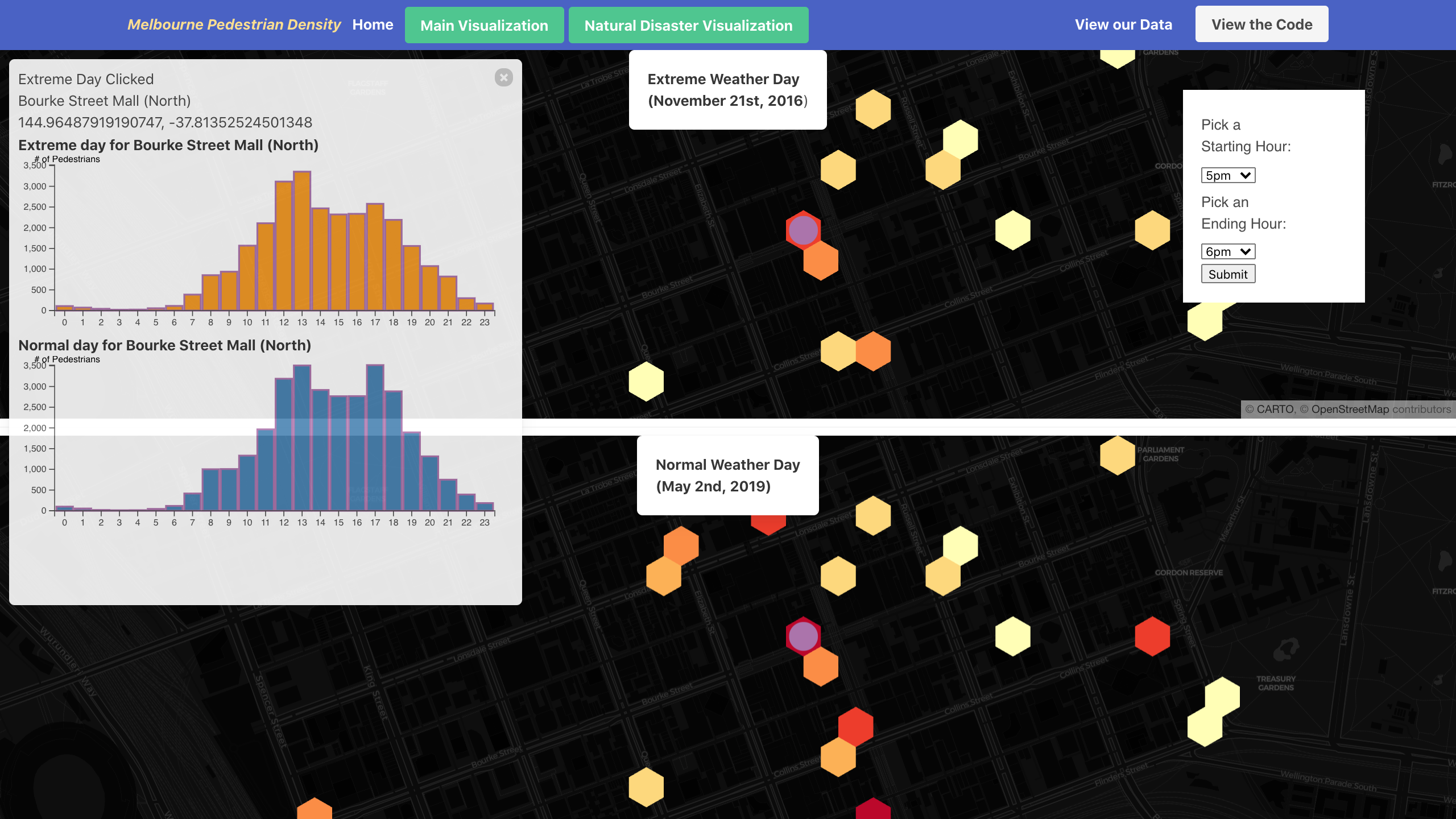
This visualization functions exactly the same as the main visualization with some changes. We are presenting
both dates we are comparing as side by side visualizations. The top visual concerns the extreme weather day and
the bottom visual shows the normal weather day. We are also utilizing the same filter box (excluding the option to filter by date) and hover information box as
the main visualization (figure 5).

The tooltip popup is the same as the main visualization except that when you click a hexagon in either
visual it will show the barchart of that hexagon you click as well as the bar chart of the equivalent hexagon
in the other visual, if it exists. Each selected hexagon will have a colored circle on top of it
to show that it was clicked (figure 6).

Contact
Ashton Sobeck
Senior Computer Science Major at Clemson University
Email: asobeck@g.clemson.edu
Richard Garcia
Senior Computer Science Major at Clemson University
Email: rgarci3@clemson.edu